Why I chose this subject
Digital transformation is often framed as a technology problem. In reality, it’s an adoption issue. In this visualization presentation, we will see how data art helps in enterprise software adoption.
Organizations invest heavily in tools designed to improve coordination, visibility, and execution. The real challenge is not deployment but its usage. This is a critical topic in business because software cost money while it should increase teams efficiency. A lack of of adoption is a lose-lose deal for a company.
Project management tools are a perfect example. Moving from spreadsheets to structured platforms promises efficiency, alignment, and scalability. But adoption is rarely uniform. Some teams embrace the change, while others resist or only partially engage.
This aligns with broader research on digital transformation, which shows that success depends less on technology deployment than on sustained adoption and behavioral change. McKinsey explained it in their article The keys to a successful digital transformation.
It is also directly connected to a broader idea I explore in my article Data art to transform organizations : how visualizing usage patterns can trigger awareness and ultimately drive change. In this use case, it shows enterprise software adoption with data art.
Description of the artwork
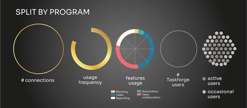
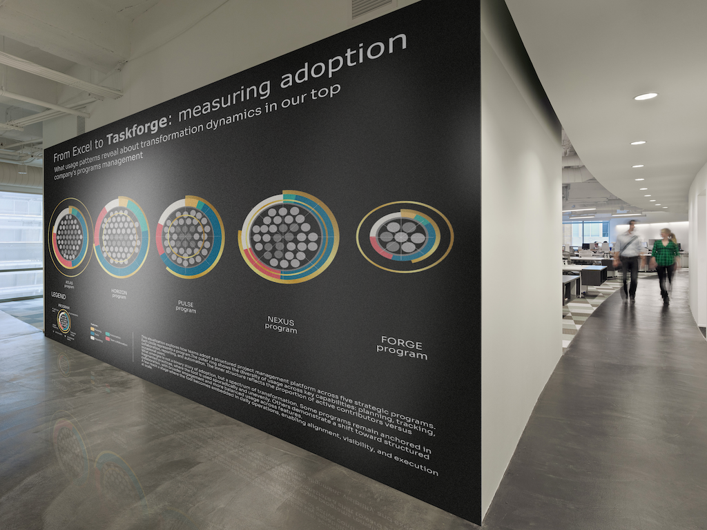
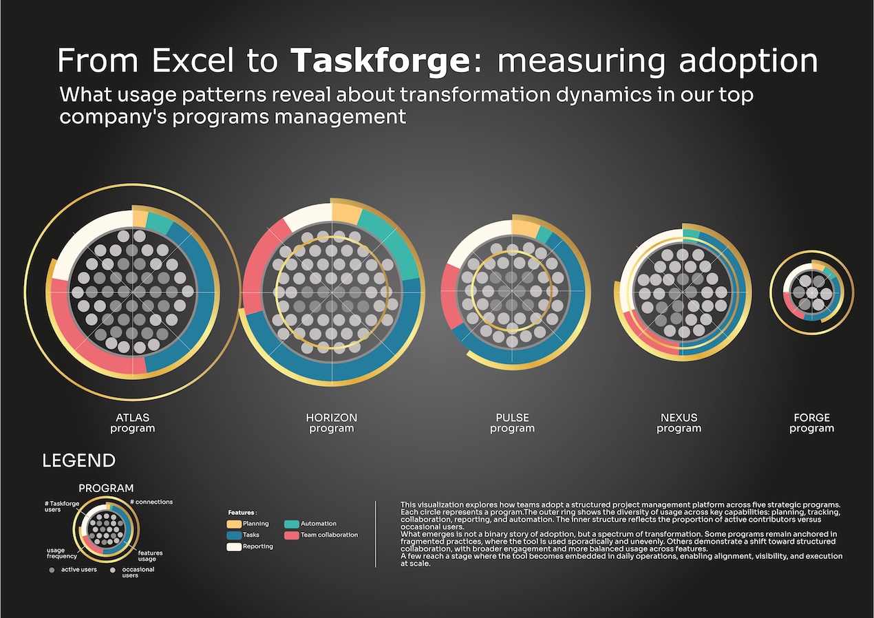
The visualization represents the adoption of a project management platform Taskforge across five strategic programs :
- Each circular form corresponds to one program.
- The outer ring shows how features are used: planning, tracking, collaboration, reporting, and automation.
- The inner structure reflects user engagement, distinguishing active contributors from occasional users.
- The density and rhythm of the visual elements suggest usage frequency and intensity.
At first glance, the shapes appear similar. But a closer look reveals significant differences:
- Some programs display fragmented usage, concentrated on a limited set of features.
- Others show balanced adoption, with broader engagement across capabilities.
- A few reach a more advanced state, where usage becomes embedded in daily operations.
The artwork invites the viewer to move beyond surface-level metrics and observe patterns of behavior.
Method and sources
This piece is inspired by real-world transformation dynamics, but the data has been intentionally abstracted and anonymized. It shows how data art helps in enterprise software adoption. The structure of the visualization is built on common adoption KPIs:
- Adoption rate
- Active users vs total users
- Usage frequency
- Actions per user
- Feature distribution
These dimensions are recomposed into a visual language that emphasizes patterns rather than exact values. The goal is to reveal, not to report.
By transforming operational metrics into an aesthetic form, the visualization creates a connection with the user, making it easier to see what is often overlooked in dashboards and reports.
Most of the time, software propose a dashboard part but it’s often a basic tracking utilization system and not enough to create users adoption. It’s even sometimes additional services with extra fees.
What this changes in enterprise software adoption
This visualization reframes how we approach transformation. It shifts the focus from
- Tool deployment to actual usage
- Availability to engagement
- Features to behaviors
By making adoption patterns visible, it challenges the assumption that implementation equals success. It highlights where transformation is truly happening.
More importantly, it creates a shared understanding across teams, enabling better conversations, more targeted actions, and ultimately, more effective change.
Conclusion
Adoption is rarely linear. What this visualization shows is that transformation doesn’t happen when a tool is deployed, but when it becomes part of everyday practice.
Some teams adapt quickly, others take time and some never fully transition.
The role of data art is not to provide answers, but to make these dynamics visible.
Because once we see them clearly, we can start to act and act more precisely.
If you’re interested in how visual approaches like this can support organizational change, I invite you to read my article: Data art to transform organizations
Here is the full visualization : Lumadataart Enterprise tool adoption visualization