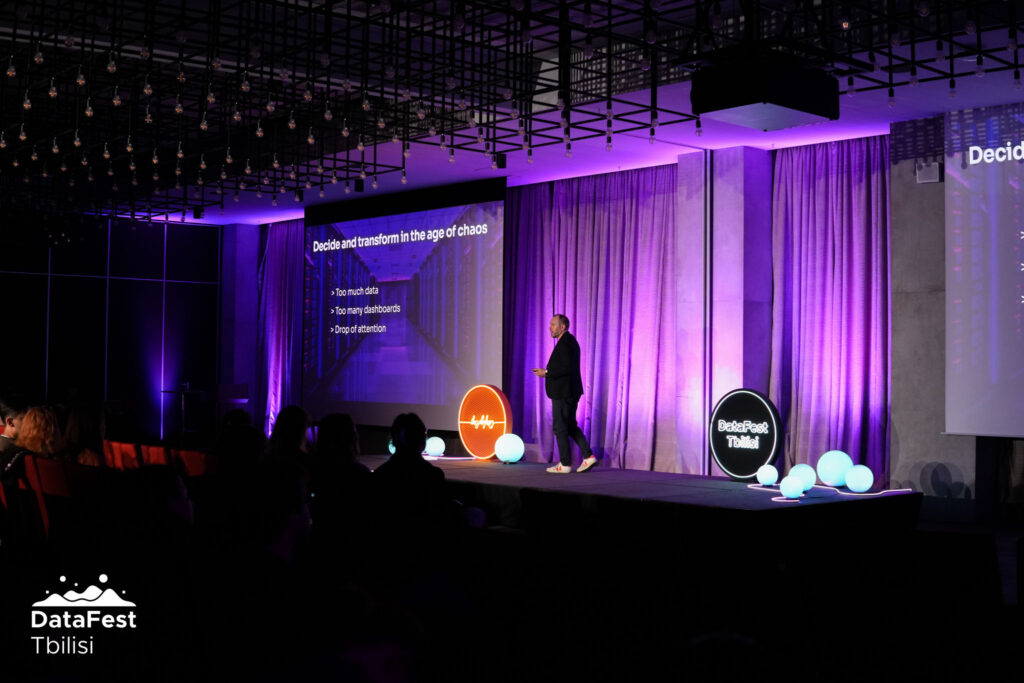
Mainstage context
I presented this talk, “The Aesthetics of Insight”, at DataFest Tbilisi in November 2025, one of the leading data events in Eastern Europe. It explores how organizations can rethink data, design, and decision-making in an age of complexity.
I also animated a 90-minute workshop but I will talk about in another article.
A huge thank you to the ForSet team for their trust. I met incredible people, learned a lot, and discovered Tbilisi.
DataFest is a rich, high-quality data event that I highly recommend, especially for its expert-driven and less commercial approach compared to many others.
Rethinking Decision-Making in an Accelerating World
The world is not just changing. It’s accelerating.
From AI breakthroughs to geopolitical instability, climate events, and economic crises, the pace of transformation is now exponential. What used to evolve over decades now shifts in months.
And in this environment, one capability becomes critical: The ability to understand data quickly — and make better decisions.
Why Decision-Making Is Breaking Down
Despite having more data than ever, decision-making is not getting easier.
In fact, it’s often the opposite.
We are facing three major challenges:
- Attention is collapsing : Constant notifications, fragmented tools, and information overload reduce our ability to focus.
- Data is exploding : We generate massive volumes of data — yet less than 2% is actually used effectively.
- Dashboards are multiplying : Organizations accumulate dashboards across teams and geographies, often inconsistent and rarely used. (Studies show that up to 70% of dashboards are never consulted.)
This creates a paradox: We have everything we need (data, tools, infrastructure) but struggle to extract clarity.
Why AI Alone Is Not Enough
Artificial intelligence is often presented as the solution to this complexity.
It helps but it is not enough.
Key limitations remain:
- Bias in data and models
- Blind spots in analysis
- Lack of contextual understanding
- No emotional intelligence
- Risk of cognitive dependency
AI can accelerate analysis but it cannot replace human judgment, interpretation, and meaning.
A Different Approach: Data Art
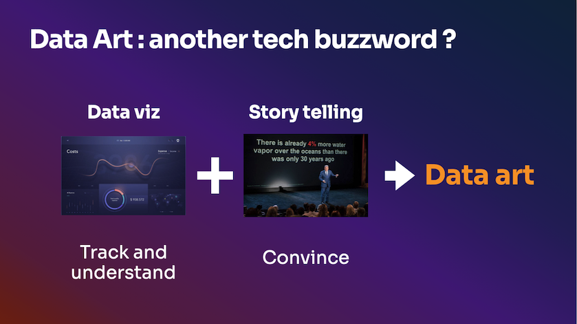
What if the problem was not only about data but about how we perceive it?
This is where data art comes in by combining analytical rigor with aesthetic design to create understanding that is both rational and emotional.
It acts as a bridge between visualization and storytelling :
| Approach | Strength | limitation |
| Data visualization | Precision, KPI tracking | Often dry, under-designed |
| Data storytelling | Engagement, persuasion | Risk of oversimplification |
| Data art | Clarity + emotion | Requires design and intent |
A data artist does one essential thing: spend time crafting information so the audience spends less time to understand it.
Why Aesthetics Matter in Decision-Making
Decision-making is not purely rational. It is a combination of: Facts + Biases + Emotions
We make thousands of decisions every day but only a few truly matter are heavily influenced by how information is presented.
Some key realities:
- The human brain processes ~70% of information visually
- 50% of brain activity is dedicated to visual processing
- Visual information is faster to understand and easier to remember
This means that if your data is not designed visually, it’s partially lost.
Aesthetic design is not decoration : it’s a cognitive accelerator !
From Insight to Action
Traditional data often fails at one critical step: triggering action
Reports, KPIs, and dashboards inform but rarely transform.
Data art changes that by combining visual clarity, emotional resonance and narrative structure
It creates memorable insights that people actually act upon.
Examples of impact:
- Supporting strategic transformation
- Driving behavioral change (sustainability, mobility, usage)
- Aligning teams around shared understanding
Knowledge is not the end. Engagement is.
How to Bring Data Art into Your Organization
Making data art operational requires more than creativity. It relies on three foundations:
1. Data Governance
Before anything else, ensure data quality, structure your data catalog and align definitions across teams.
Bad data leads to bad decisions and it happens faster with AI.
2. Skills & Collaboration
Data art sits at the intersection of data (engineers, analysts), business understanding and design.
You don’t necessarily need new roles depending on your entity size.
A pragmatic approach is to train data analysts in data design principles and foster collaboration between teams (data, design, business).
3. Tools & Process
Most organizations already have the tools:
- Data: Python (Pandas, Matplotlib), BI tools
- Design: Figma, Illustrator, Affinity Designer
- Development: JavaScript (D3.js)
What matters is how you connect them with aesthetics.
The Data Art Process
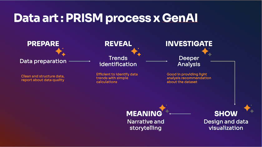
I’ve created a simple 5-step framework to produce data art :
- PREPARE : the most difficult and longer task, data preparation used to clean, structure, model
- REVEAL : the trend identification part to detect key signals
- INVESTIGATE : the analysis part used to uncover deeper patterns
- SHOW : data visualization part by designing the visual experience
- MEANING : the final narrative part to craft meaning for your audience
This is my PRISM framework I used in all my creations to keep in mind each step of a data art design.
The Role of AI in Data Art
AI is not the creator but an accelerator to create meaningful data stories.
It shows best performance at the beginning of the data process :
- Automating data preparation
- Detecting trends faster
It can supporting in the analysis part but human is more able to read between the lines and identify best stories angles.
AI can help but the lead is clearly human in the last parts :
- Data visualization, even if AI can suggest visuals
- Meaning and narrative
Because we’re good in interpreting meaning, designing emotions and create stories. We can sum it up as : AI refines but humans create.
Beyond Decisions: Driving Transformation
Organizations often underestimate one key factor: change management.
An innovative or a new project fails because of this part where companies are more able to save money. Wrong saving because data alone does not create change and you lose money on the last miles !
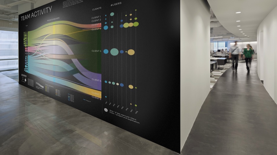
But when data becomes visible, emotional and shared, it creates alignment and momentum.
Imagine a living visual of your organization’s activity (projects, users, impact) displayed in a meaningful, aesthetic way.
It’s not just a dashboard. It’s a narrative people can feel.
And feelings are the beginning of a change.
Key Takeaways
- The world is accelerating, faster than our ability to process information
- More data does not mean better decisions
- AI helps, but cannot replace human understanding
- Data art bridges rational insight and emotional engagement
- Better perception leads to better decisions and real transformation
If you’re interested in bringing this perspective to your organization or event, feel free to get in touch.