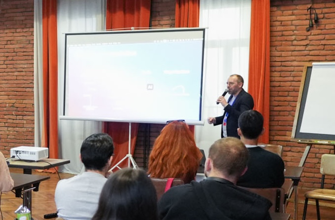
In November 2025, I ran a 90-minute data art workshop at DataFest Tbilisi for around thirty data and analytics professionals. The premise was simple: data art is not a decoration practice. It is a decision-making tool — and one that most organizations are dramatically underusing.
The problem I wanted to address with this data art workshop
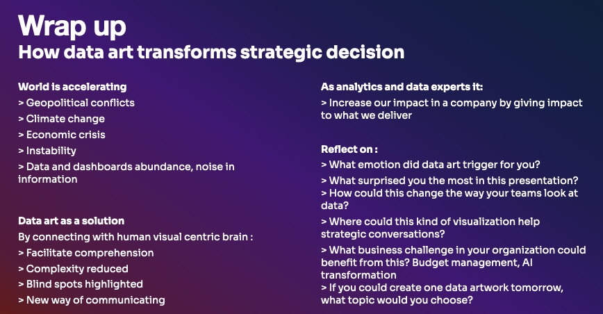
We produce more data every two years than in all of human history before that. Less than 2% of it gets properly analyzed or used. Meanwhile, dashboards multiply, attention decreases and decision-makers struggle to decide.
In analytics, we all build reports and dashboards and work hard on analysis that land on a leadership table and disappear. The data is there but the signal gets lost.
Data art is one answer to that problem : instead of giving people more to read, it gives them something to see and feel.
Why the human brain matters here
Strategic decisions are rarely made by people who are indifferent. There is always emotion, urgency, politics, inertia. A standard chart asks the viewer to work. A well-designed data visualization does the work for them : compressing complexity, surfacing patterns that resist verbal description, and creating the kind of visceral understanding that sticks in a meeting room.
Florence Nightingale understood this in 1854. Her coxcomb chart on Crimea War mortality did not just present death statistics — it made the preventable nature of those deaths impossible to ignore. The data was already there and the visualization made it land.
More recently, Federica Fragapane’s Shapes of Inequalities or Nur Adhyaksa Hamid’s carbon debt visualization from the Pacific Dataviz Challenge show the same logic applied to contemporary complexity.
These are arguments made in visual form and it gives a strong power and even a pivot to analytics teams !
Data art prerequisites to decide
It’s not just decoration or upscaled data visualization but a cross-road between data matter, design and organization.
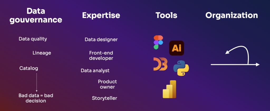
Data Gouvernance
It’s fundamentally to take care about data catalog, quality and lineage. What are the data we have and what is the data quality ? I always remember someone telling me that bad data = bad decisions.
Expertise
Data expertise and analysts, of course. But also designer, front-end developer, product owner to connect with the outcome expected and storytelling
Tools
Most of them are design tools used in other teams. It’s a good occasion to talk to marketing, communication and development teams to know about Figma, Adobe Illustrator, Affinity Designer or D3.js.
Organization
Today, we know that it’s better to build with the audience and improve sprint after sprint rather than build by ourself after getting a brief or a rough idea about what could be highlighted. Agility is a strength to connect with the audience who becomes a part of the outcome.
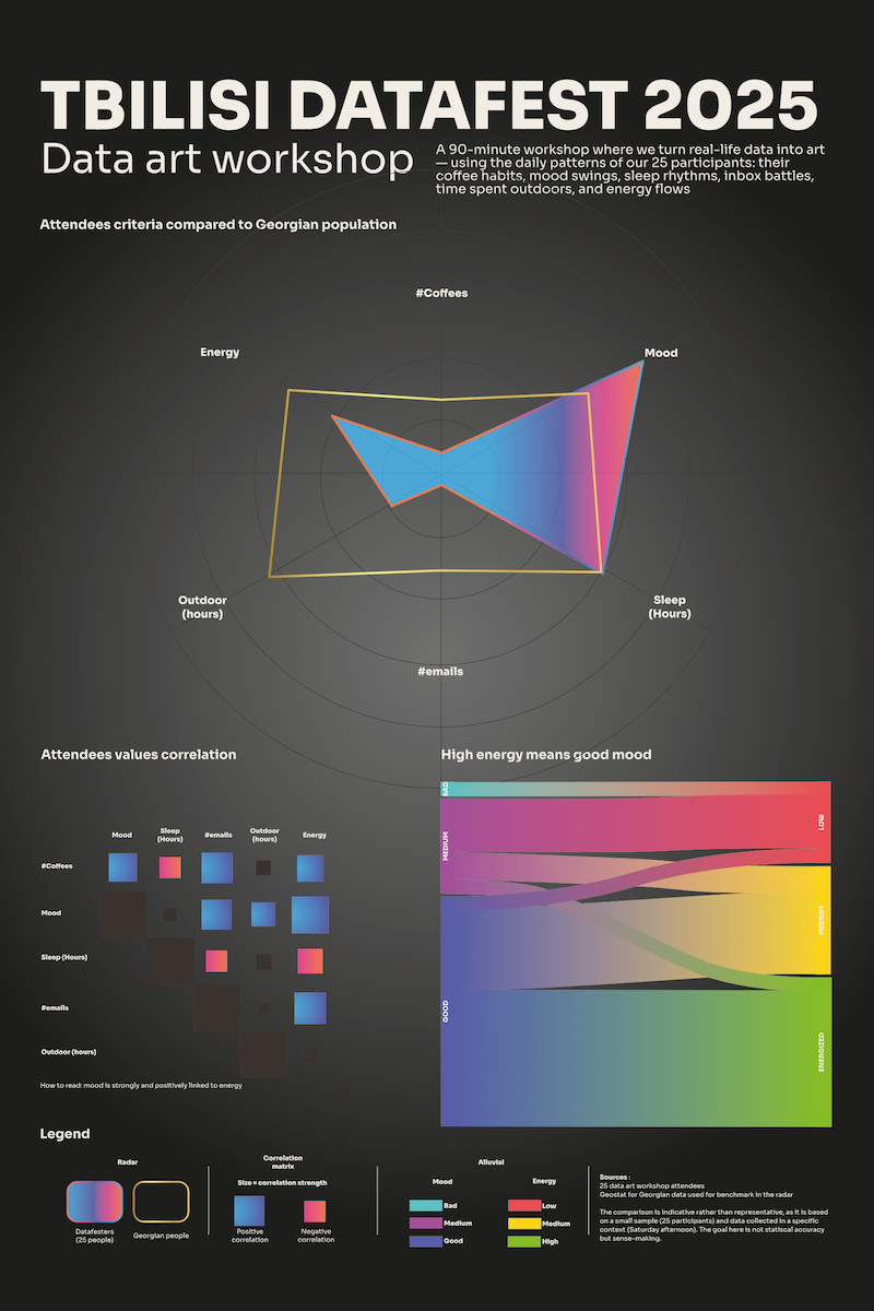
What we built together in this data art workshop
It takes me a lot of time to decide what could be done in this 90 minutes workshop. Build together a piece of data art based on a standard dataset ? I selected many use cases that might talk to everyone. But lately, I imagine something more personal.
The workshop was hands-on from the first minutes. Rather than lecturing on the theory of data art, I asked participants to become the data: each person filled in five variables about their day :
- Coffee count
- Mood level
- Hours of sleep
- Emails read
- Time outdoors
- Energy level
Thirty rows of anonymous human data, collected in real time. We then worked through the full process together:
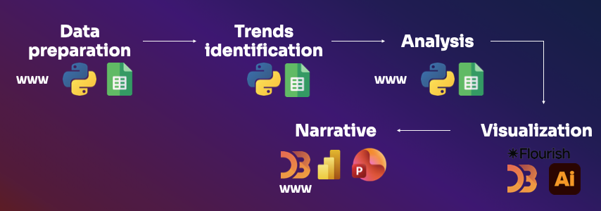
Data preparation
Cleaning, checking for missing values, understanding what we actually had. GenAI turned out to be useful here: fast at identifying duplicates, flagging format inconsistencies, summarizing data quality. Excel can do it to and, even better, a python program help to correct and highlight data quality issues.
Trend identification
Basic descriptive statistics and correlations. Does more sleep predict better mood? Does outdoor time affect energy by end of day? A python program highlight it but GenAI again handled the mechanical side efficiently.
Analysis
This is where the human judgment starts to become irreplaceable. Interpreting correlations in context, comparing against benchmarks, making meaning out of numbers. Tools can assist. They cannot substitute.
Visualization
This is where the human judgment starts to become irreplaceable. Interpreting correlations in context, comparing against benchmarks, making meaning out of numbers. Tools can assist. They cannot substitute.
Narrative
Connecting the visuals into a story. This is the hardest part, and the one AI handles least well. It requires an editorial instinct, emotion and practical business knowledge: what does this data mean for the people looking at it? What decision should it inform? The best data art provides sources and legends, uses annotation strategically, and does not mistake a beautiful image for a clear argument.
Where AI actually helps and where it doesn’t
This is the big question in 2025 and 2026 : will I be replaced by AI ?
I was direct about this with the audience : AI is genuinely useful in the first half of the process. It can clean and structure data fast, run basic statistical summaries, and suggest chart types from a catalogue.
But it cannot replace the narrative judgment, the aesthetic choices, or the organizational instinct for which story needs to be told to which audience in which moment. That part remains human for the moment.
Because the real question is how and where AI can help me. It’s a companion.
In short, AI makes the technical floor of data art more accessible but the creative and narrative side rema human.
What participants walked away with after the data art workshop
90 minutes ran pretty fast ! I had the time to finish the whole data art process and answer some questions.
I hadn’t had the time to ask my reflection questions:
- What emotion did this data art trigger for you?
- What surprised you most?
- How could this change the way your teams look at data?
- If you could create one data artwork tomorrow, what topic would you choose?
Audience questions were very concrete : what about governance ? How to prevent biases ? How to treat outliers ?
In the plane between Tbilissi and Paris and thanks to the complete dataset, I started to shape the data art based on this workshop. Not so easy because it’s the raw data I’ve got. But that’s where human is strong : identify insights and angle to build a data story. A souvenir from this amazing journey at the Tbilissi DataFest.
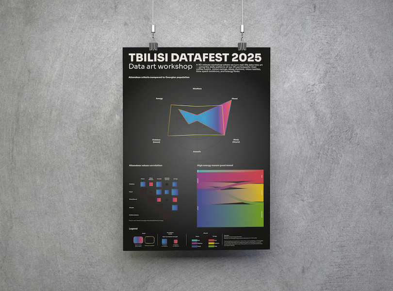
The data artwork we built together from the workshop data was made available to participants two weeks after the session. You can see the full here: lumadataart 90 minutes Tbilissi DataFest workshop.
Resources shared during this data art workshop
Here are the wrapping up slides :
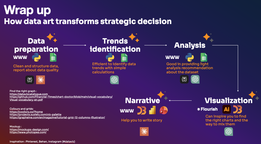
For anyone who attended or wants to go further:
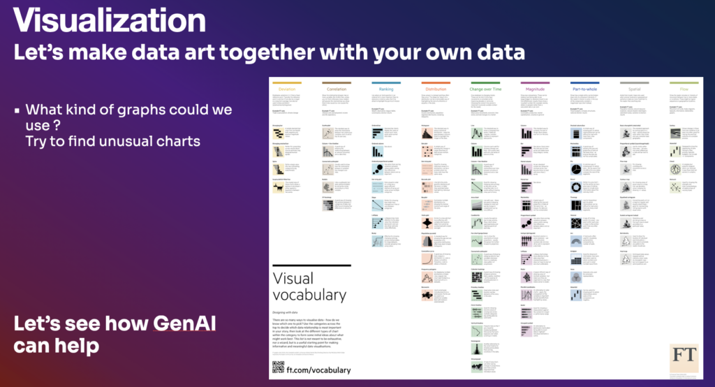
- Chart catalogue: datavizcatalogue.com and the FT Visual Vocabulary
- Colour tools: coolors.co and Viz Palette by Elijah Meeks
- Visualization platforms: Flourish for rapid prototyping, Adobe Illustrator or Affinity Designer for final production
- Inspiration: Pinterest, Behance, Instagram (#dataviz)