How can data art help leaders manage teams more effectively?
I designed this visualization to demonstrate how data art brings value to business management. It may not replace daily dashboards, but it offers a strategic perspective for quarterly reviews or team retrospectives.
This kind of visualization helps answer critical questions:
- How are resources, time, and energy being spent?
- Who are your main clients?
- Are your efforts aligned with the right accounts and priorities?
These insights are fundamental, especially for B2B organizations where alignment with strategy is key.
Why This Matters for Leaders
As a manager, you need more than just operational numbers. You need to communicate meaning.
- Executives want to see if investments align with corporate strategy.
- Team members need to understand why their work matters.
Even the most operational team benefits from a medium- and long-term view. It helps them adapt, refine their work, and stay aligned with the company’s objectives.
And to truly capture attention, raw tables aren’t enough — you need impactful visuals.
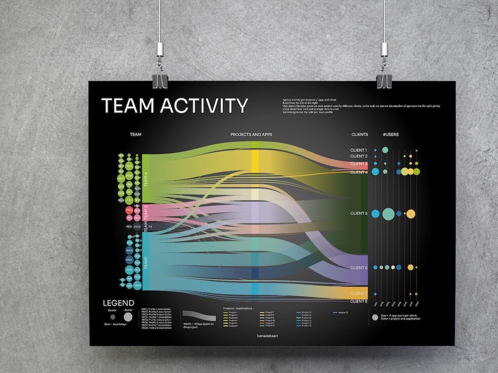
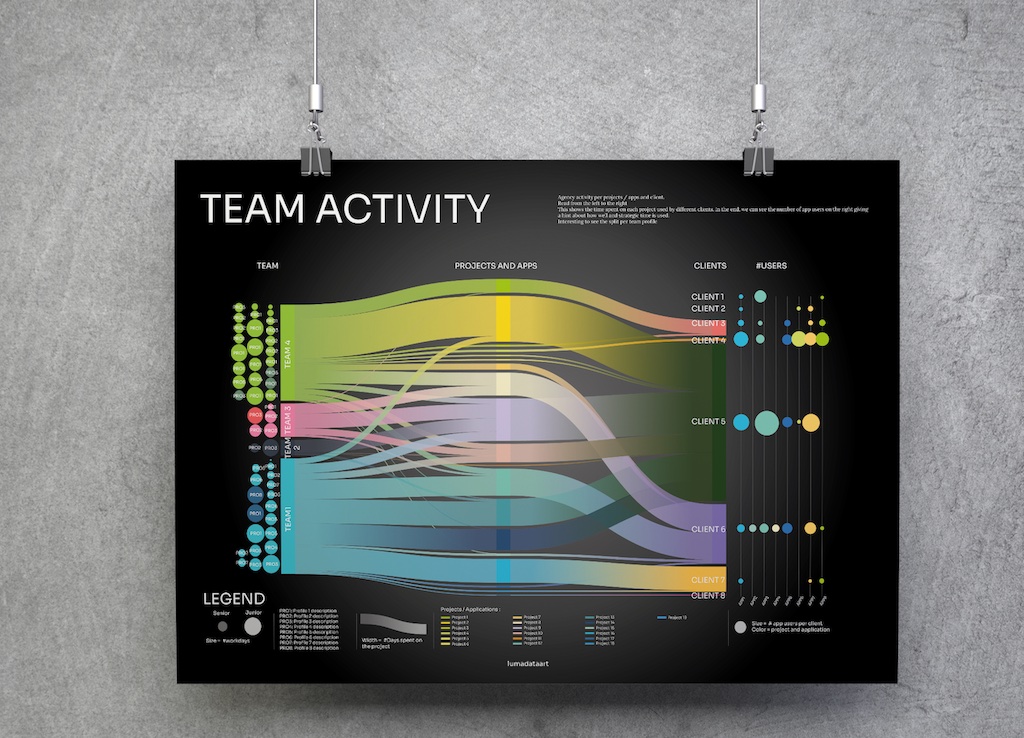
How to Read This Visualization
This data art piece tells a story, from left to right: your team’s story.
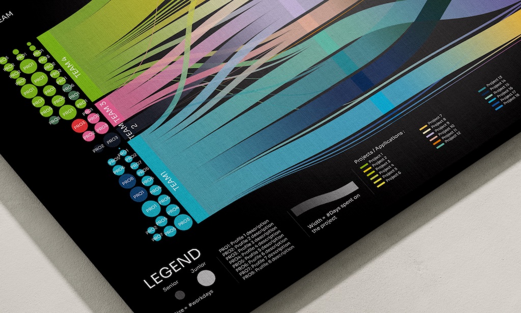
- Team composition: on the left, the number of full-time employees (FTEs) per role — analysts, developers, UX designers… This makes it easy to optimize team structure, scaling or reallocating profiles.
- Projects: in the center, each bar represents time spent on a project. Larger bars highlight bigger or more critical projects. If your most time-consuming projects are not the most strategic, it’s a red flag to address.
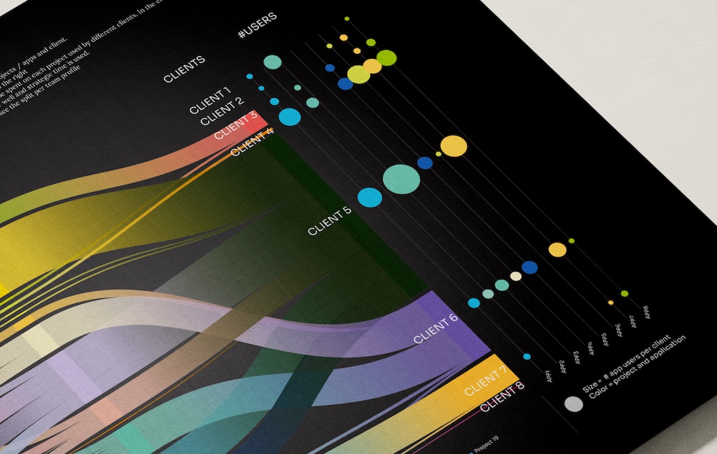
- Clients: on the right, bars show internal clients or business units, with the number of users per project. This helps identify where to seek sponsorship, budget, or synergies.
When to Use This Chart
This visualization is highly effective in several contexts:
- Board or executive meetings: to highlight your team’s contributions.
- Budget negotiations: to justify resources and plan for next year.
- Team workshops or retrospectives: to reflect on past activity and spark discussions on improvement.
Where to Display It
To maximize impact, don’t keep this visualization hidden in a report. It can live:
- As a poster in your workspace,
- On a rotating screen, so people can reflect on it over time,
- In your company’s annual report, where data art makes information more engaging and easier to digest than dense text.
Conclusion
Data art is more than just aesthetic. It transforms raw numbers into memorable, meaningful, and actionable stories. For leaders, it’s a way to communicate strategy, align teams, and drive change.
If you have any question or want to know how data art can help you to drive change in your company, just send me your impression or share it in comment.